A calm, therapeutic brand and product experience that gave the business confidence to invest in the full product build.

Brand Direction
Product Design
Prototyping
& Testing
Niche Care is an AI powered training app for care workers,
built around a novel concept: an AI that roleplays as a
difficult patient, putting carers through realistic,
challenging conversations to build their confidence.
Working alongside Minimal Viable Launch, I led
brand direction and product design across the full process,
from early research and discovery through to a polished,
tested prototype. The core challenge was validating whether
the concept was worth building at all, while navigating a
heavily regulated sector and designing training that people
would engage with rather than rush through.
The
research and design work gave the business enough conviction
to move forward, ultimately supporting a funded build with
ambitions to become a direct B2B platform for care
businesses nationwide.
Case Study
Care worker training in the UK is largely compliance driven, people skim content to get a certificate rather than anything that changes how they work. Niche Care, which operates children's care home facilities across the UK, wanted to explore whether AI led scenario training could do something existing methods couldn't: put carers in the kinds of difficult, emotionally charged situations they face daily and build real confidence through practice.
The challenge was threefold. First, validate whether the concept had value before committing to a full build. Second, do that in a sector wrapped in regulatory complexity, where safeguarding, data sensitivity, and professional standards shape every design decision. Third, design scenarios that were realistic and challenging enough to be useful, without being so intense they triggered the very people the product was trying to support.
To get to the real need rather than the assumed one, we ran a product design sprint engaging directly with Niche Care stakeholders and people in care settings. Stakeholders surfaced two core features that would anchor the product: the AI scenario engine, where the AI takes on the role of a difficult patient and guides carers through realistic, emotionally challenging interactions, and Reflections, a private journal giving carers a space to log their own wellbeing while providing care homes with visibility to offer support where it was most needed.
The sprint produced user flows and a clear set of prioritised concepts to take into design.

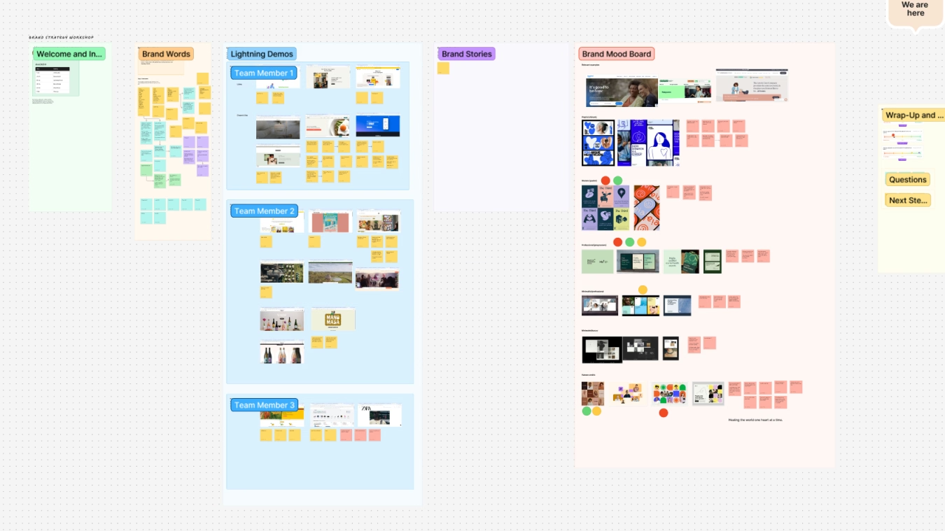
The brief was clear that the new product needed to be disconnected from Niche Care's existing brand. This was a standalone platform with its own identity. I led a brand workshop with stakeholders to establish direction, which opened up conversations we hadn't anticipated.
Three directions emerged from the synthesis: a minimalist approach with earthy tones, a graphic style with vibrant colours built around people, and an illustration direction using pastel colours. The third option sparked an important conversation that hadn't come up before, the risk of visual triggers for carers, and the critical role of therapeutic language in how the product communicated. It surfaced that therapeutic care was the most current and up to date approach in the sector, and that the product's tone needed to reflect that from the ground up. Unlike many brand workshops where research and stakeholder preference pull in different directions, here they aligned. Option three was selected with virtually no refinements. The illustration style was intentionally aligned with the visual language of mental health platforms and therapy, using soft, approachable figures to signal safety and trust before a single word was read.

Working from the user flows produced in the sprint, we moved into wireframes across the core journeys: the AI scenario experience and Reflections. The wireframes were shared with stakeholders across a couple of rounds of review, with iteration based on their feedback. Where feedback started creating loops rather than progress, we ran a priority matrix to cut through and keep things moving.
The wireframing process also helped the Niche Care team work through questions that went beyond layout. How should content be structured and presented to users? What role would video and slideshows play alongside the AI? Who would be creating and presenting the content, and how? And critically, how should the AI behave within scenarios to feel convincing without crossing into territory that felt overwhelming or artificial? These were as much product decisions as design ones, and the wireframes gave the team a shared surface to resolve them.
The wireframes evolved into high fidelity designs and a fully interactive prototype. A set of design tokens and core components were established to maintain consistency across the product, covering colour, typography, spacing, and the repeating UI patterns used throughout. The illustration direction came into its own at this stage, with warm sage green backgrounds and diverse figures used across the login and onboarding screens, carrying the product's tagline: "When carers fly, safe futures follow."


We built a testing script covering the core user journeys and recruited five participants internally from Niche Care, disconnected from the app development process, a mix of frontline carers and senior staff. Sessions combined open ended questions with structured usability testing to capture both behavioural and attitudinal responses. Findings were synthesised using affinity mapping to balance usability data with the qualitative, human responses the subject matter naturally surfaced.
Usability testing surfaced consistent issues with the placement of inline feedback during scenarios, flagged independently by multiple participants as feeling disconnected from the flow. These were actionable, specific findings rather than vague preferences. The attitudinal responses were overwhelmingly strong. All five participants said the scenario approach was preferable to their current training, with one admitting they currently spend their time flicking through training to get a tick box, and a senior carer saying she didn’t understand why no one had built something like this before. The sessions also generated ideas beyond the original brief, including manager curated scenarios, targeted training tied to individual young people, and monthly reporting for care homes, pointing to a platform with room to grow well beyond the initial brief. A participant flagged the need for a content bypass feature for potentially triggering scenarios, directly echoing the conversation that had first surfaced in the brand workshop.

The final designs were user validated and dev ready, delivering a web and mobile based platform built around two core experiences: scenario training and Reflections.
The entry point was a login screen leading into a personalised dashboard that greeted carers by name and displayed their current growth plan, scenarios completed, and time invested at a glance. The home screen was structured to make progress visible and motivating without feeling like a performance review.
The My Learning section housed the carer's content plan across rolling monthly growth plans, with notes, tasks, and self reflection prompts built in alongside the scenario library. The growth plan view laid out completed, current, and upcoming plans side by side, with tasks and notes sitting inline so carers could track where they were without leaving the page.
Reflections gave carers a dedicated space to log confidence, knowledge application, and anxiety management scores alongside written summaries and upcoming tasks. A trend graph tracked their scores over time, giving both carers and care home managers visibility into wellbeing patterns and areas needing support.
The illustration style was integrated consistently across the app, reinforcing the warm tone at every touchpoint and keeping the product feeling cohesive from end to end.

The research gave Niche Care the confidence to move forward with development. The funded build went ahead, with Minimal Viable Launch securing a substantial development contract covering several months of work. The product is currently in development, with the intention of rolling out internally first before becoming a B2B platform for Niche Care to market directly to care businesses nationwide.
Recruiting a broader range of frontline carers would have strengthened the validation. Senior stakeholders in the sessions were broadly positive, but they weren’t the people who would use it week to week, and there’s a meaningful difference between someone endorsing an idea and someone who’d rely on it daily responding to it. More time with lower level carers, or a supplementary testing method to pressure test the responses we were getting, would have given the findings more robustness. That’s not a criticism of what was done, just where the next version of this process should go.


