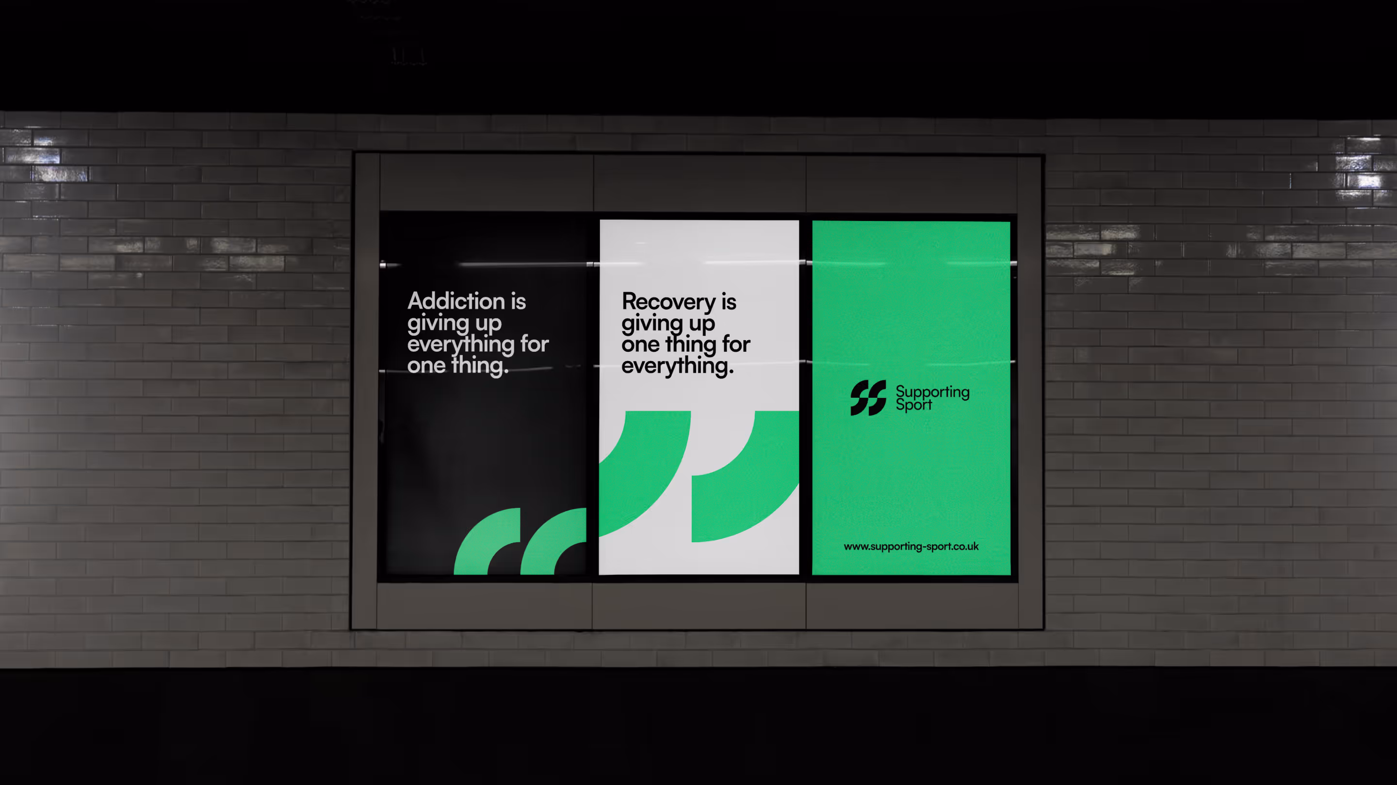
A bold, recognisable brand that enabled Championship-level sponsorship conversations and established credibility within professional sport.
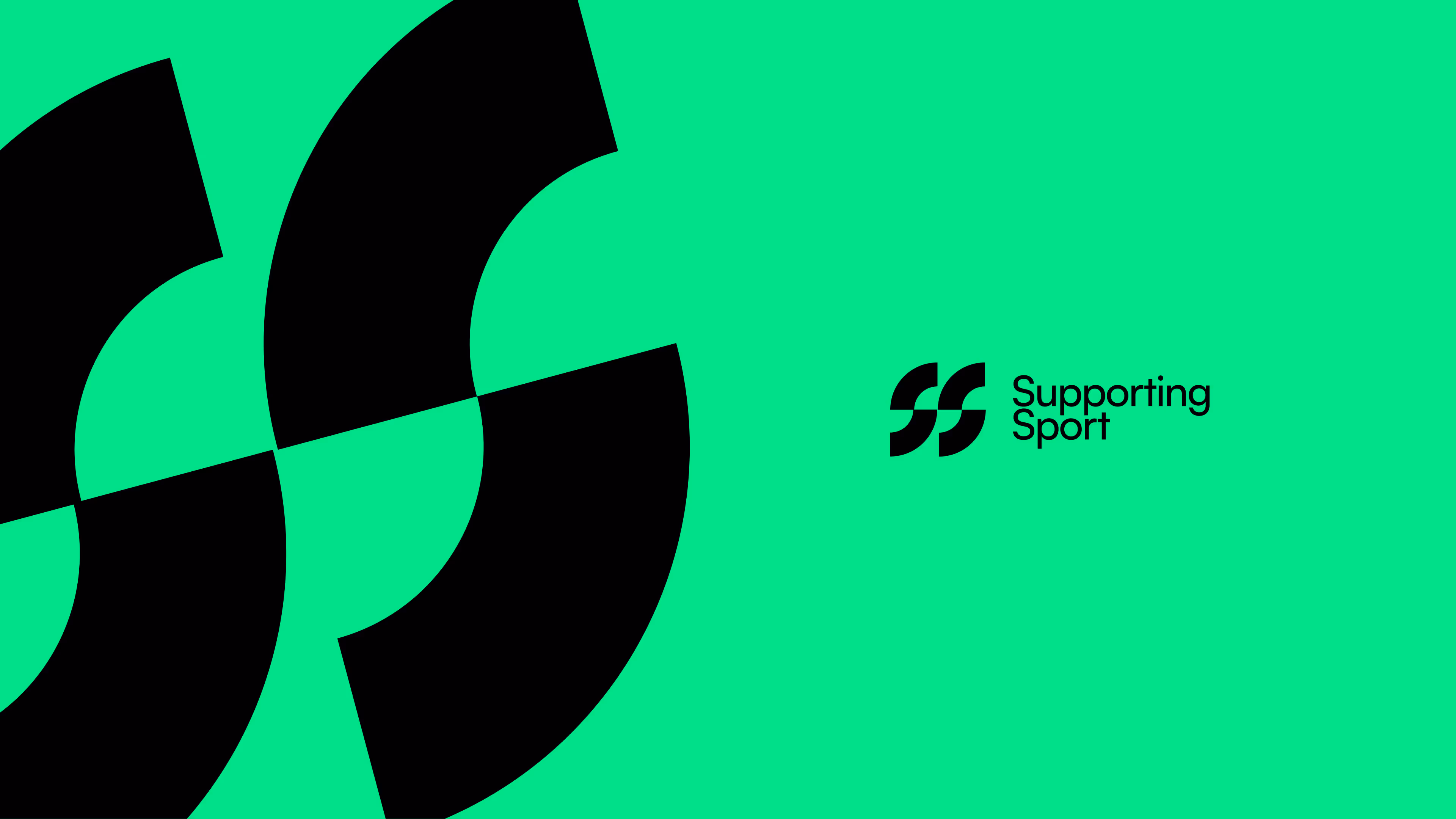
Brand Identity
Visual Design
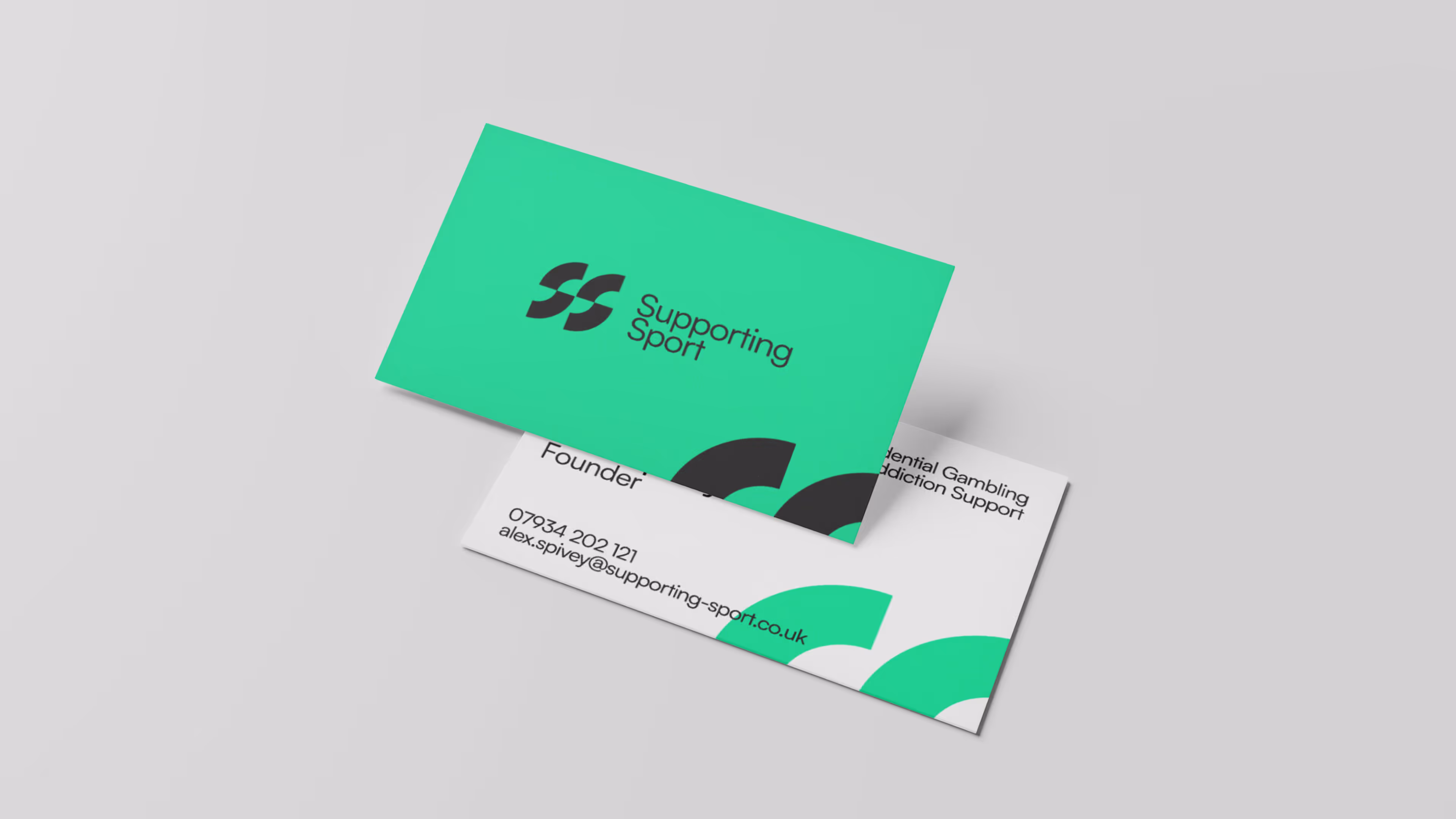
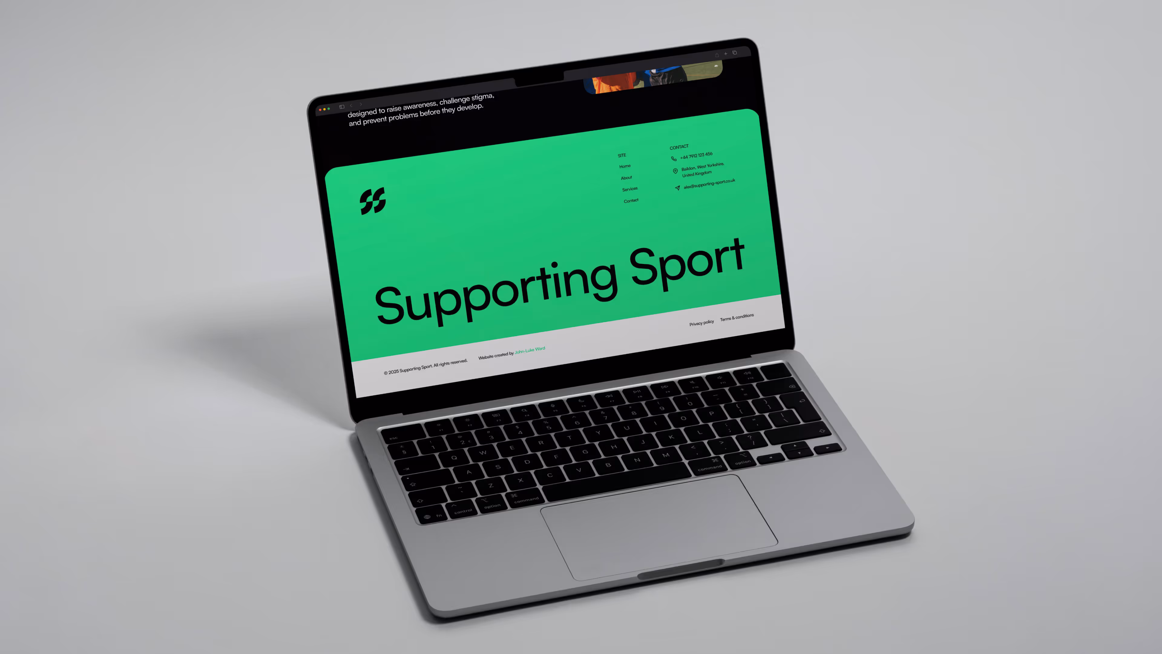
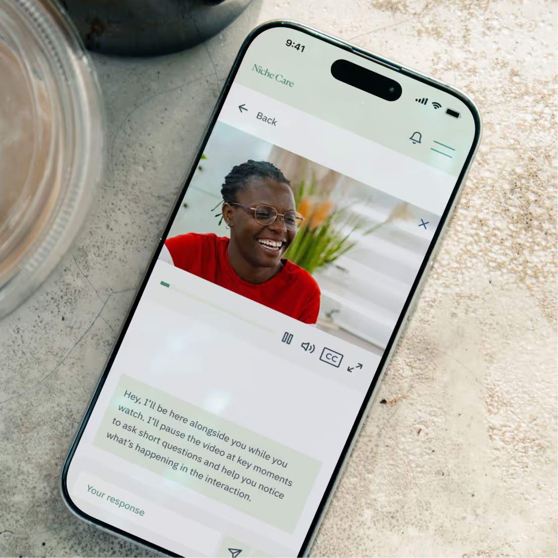
Print & Digital Assets
Brand Presentations
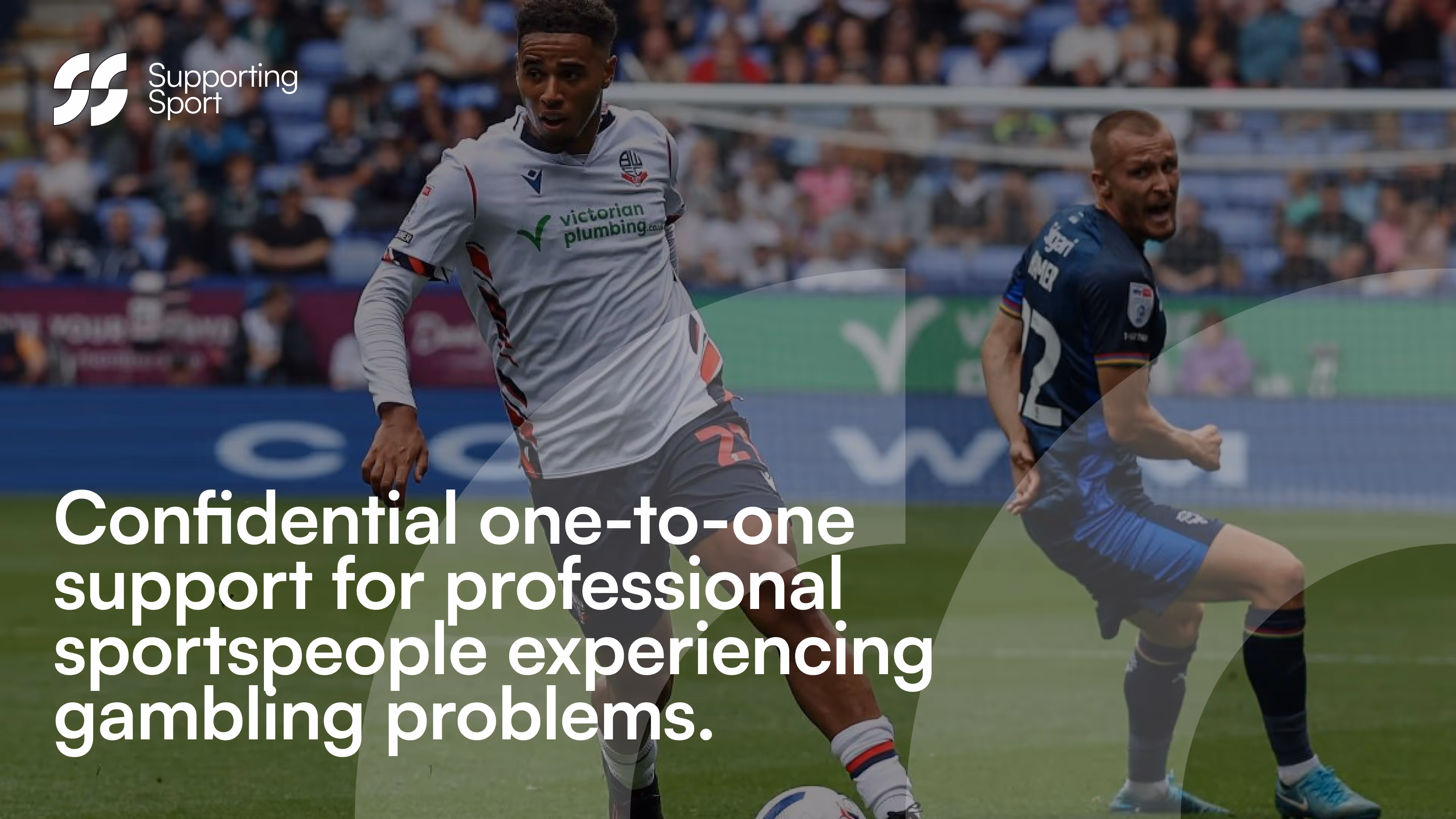
This project involved creating a credible, recognisable brand for a growing organisation supporting sports professionals dealing with gambling addiction.
The business needed to move beyond a grassroots feel and present itself as a legitimate, trustworthy organisation one that could operate confidently across professional sport, engage stakeholders, and support sensitive conversations without feeling clinical or detached.
My role focused on establishing a clear brand system that balanced energy, clarity, and credibility. The visual direction was intentionally bold and vibrant, reflecting the world of professional sport while remaining accessible and supportive. This approach helped position the organisation as proactive and modern, rather than reactive or remedial.
Alongside the core brand identity, I supported the business with a wide range of practical assets, including digital materials, printed collateral, and presentation templates. These were designed to work day-to-day, giving the team tools they could use consistently across partnerships, outreach, and internal communications.
The rebrand played a key role in helping the organisation pursue sponsorship conversations with Championship-level clubs, strengthening its presence within professional sport and supporting ongoing business growth.