A coach-led running app, brand direction, product design, and a complete visual identity built for investment discussions.

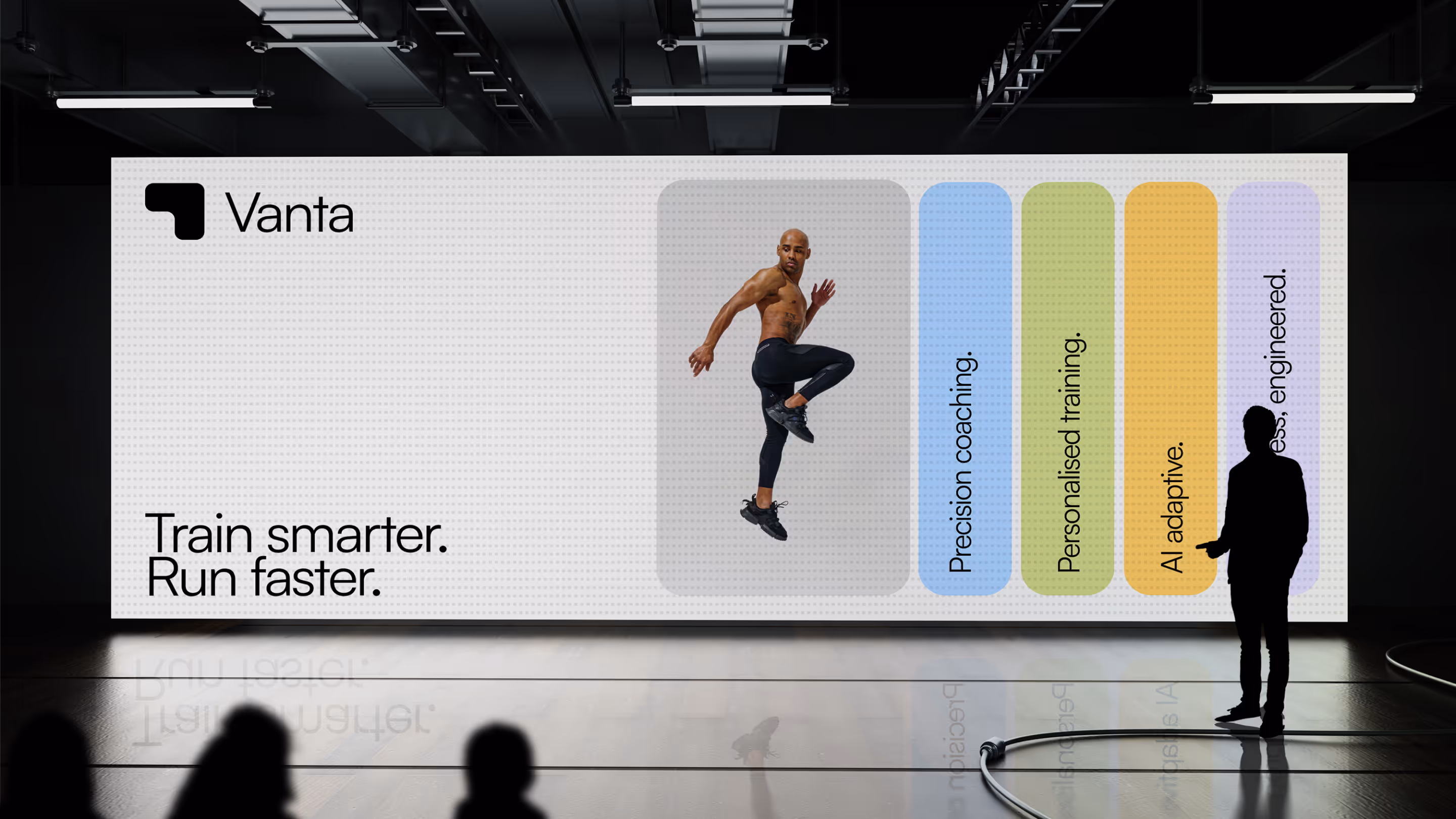
Brand Direction
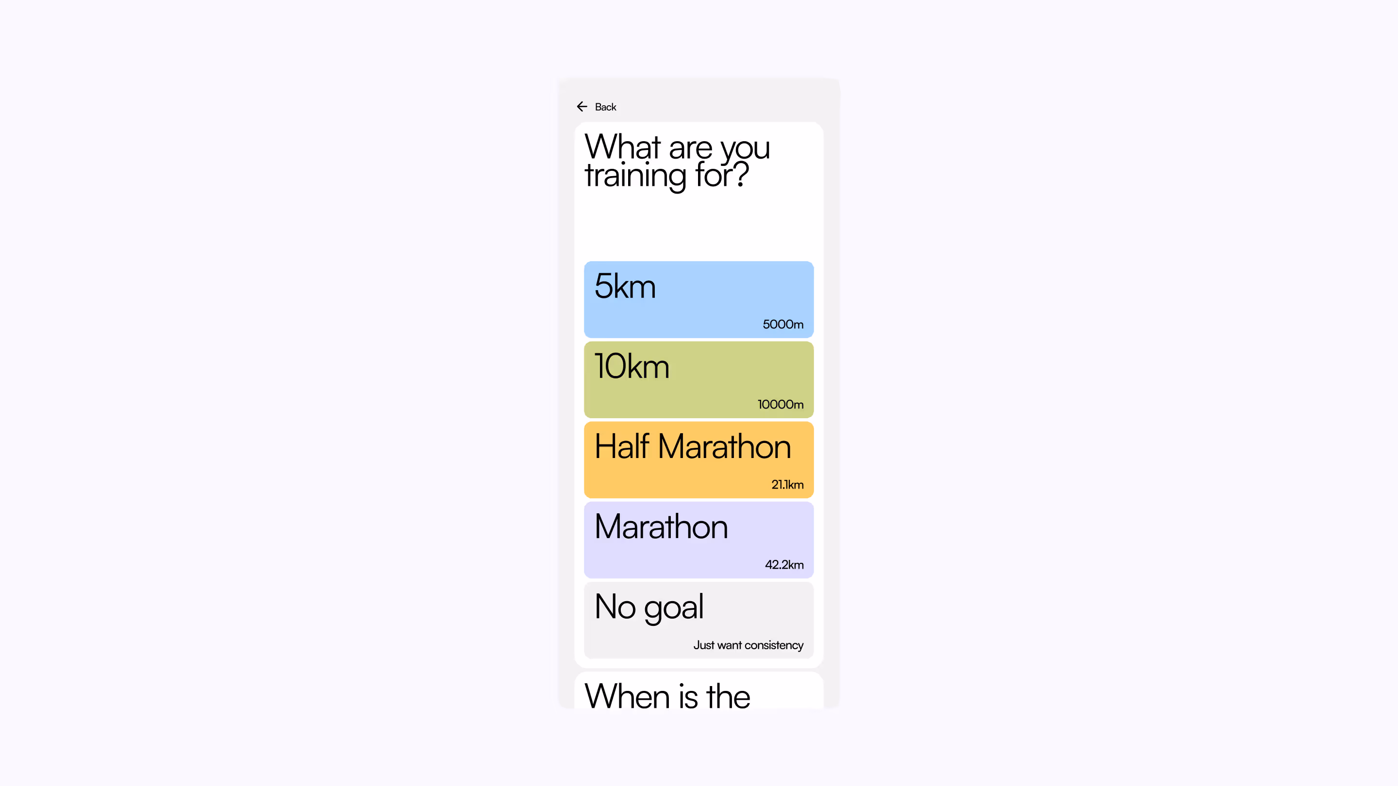
Product Design
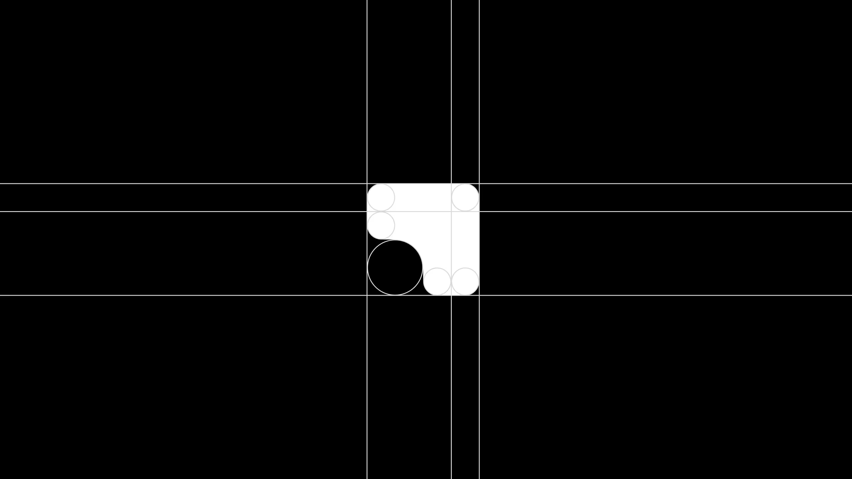
Visual Design
Vanta is a running app designed around a more conversational, coach-like relationship with its users. Rather than focusing purely on performance metrics, the product explores how guidance, encouragement, and ongoing dialogue can support runners over time.
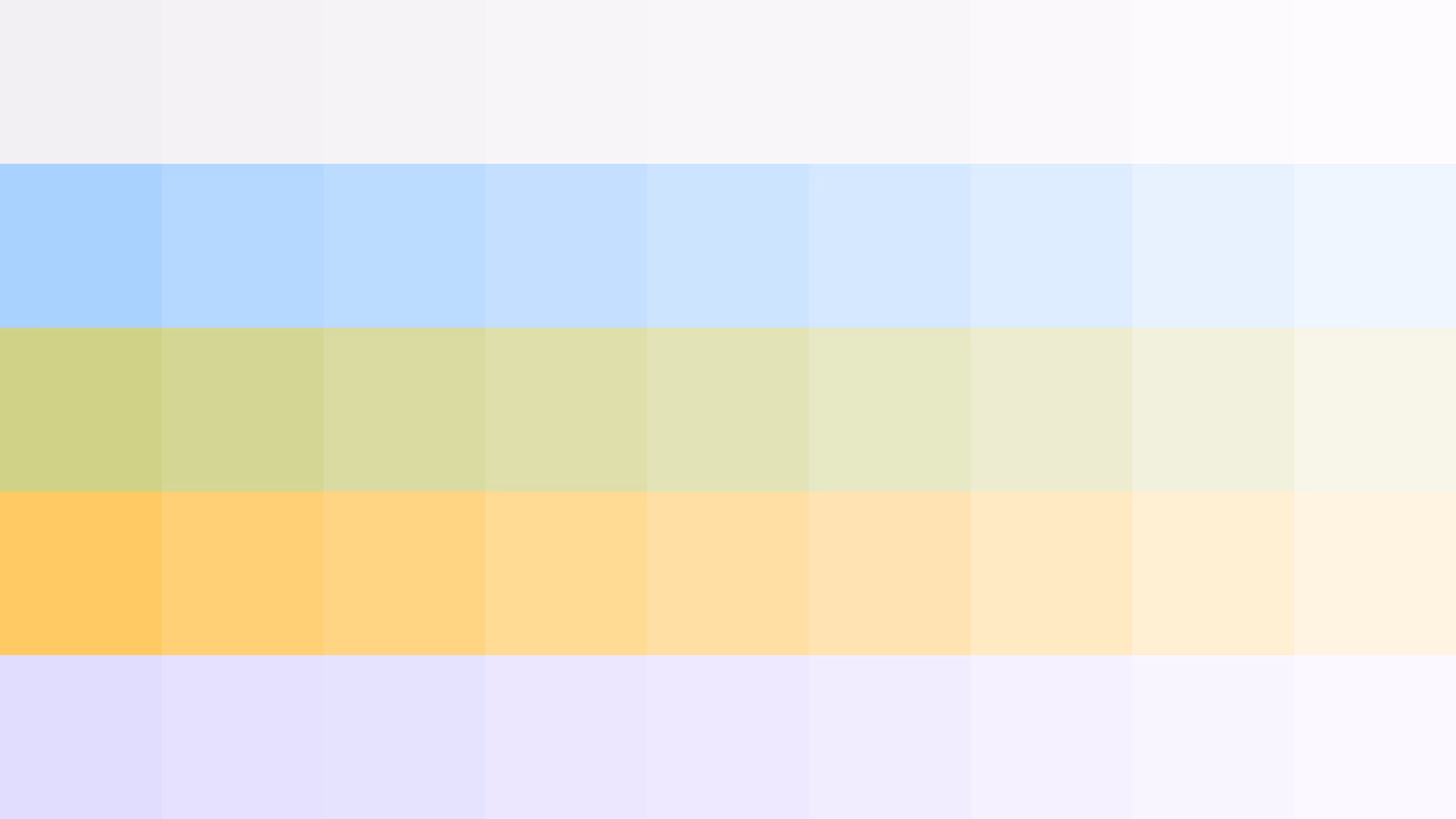
My involvement focused on early product thinking and brand direction, shaping how the app would position itself to both consumers and potential stakeholders. The brand was intentionally inviting and accessible, using a light, pastel colour palette to balance motivation with approachability.
The work produced a complete brand system and product design foundation, covering visual identity, UI direction, and key app screens, giving Vanta a clear, communicable vision for the next stage of development