01.-
Brief
Problem statement
This project already had developer resource behind it, so only design was needed. The website required
modernising as the previous one had been developed several years ago as a placeholder to showcase
their services and did not add the value to their business that a modern and functional website would.
Competitors within the sector had recently updated their websites and the team did not want to fall
behind in terms of online presence.
I had free reign over this design as the site was to be custom built and the business had
little to no previously established brand.
02.-
The Design
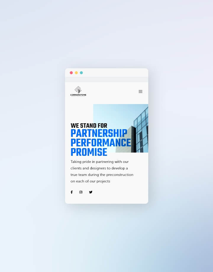
To stand out in a space where competitors all tend to copy each other and not show any real innovation through their digital presence.
A key downfall of many current websites is their similarity, particularly between competitors in a given
space. In a crowded competitive environment, this site build needed to stand out to promote the client
above the competition. Competitor analysis revealed patterns forming in terms of style and imagery
amongst similar websites. The team had a great existing photography resource already, and a lot more can
be done to images to elevate them beyond simply applying filters as many of the competitors seemed to be
doing - and whom had inadvertently started to look generic in doing so, such as layering with graphics,
simple typography overlays or masks to work with the imagery rather than have it as this static element
on the page.
I wanted the website to have a natural flow, with the use of whitespace to help the content feel
like it had room to breathe. My thought around this and the simplicity tied into it also came from a UX
perspective. Being conscious of the need to balance aesthetic concerns with functionality, I
deliberately used of a selection of neutral colours that not only complemented each other, but that did
not compromise on accessibility guidelines - ensuring all colour combinations met WCAG AA standard. The
simpler the design, the less likely it is to compromise on WCAG standards. Bearing in mind a website's
entire user base demographics in this way is extremely important, and as a designer and developer it is
part of my job to keep raising awareness for accessible websites.
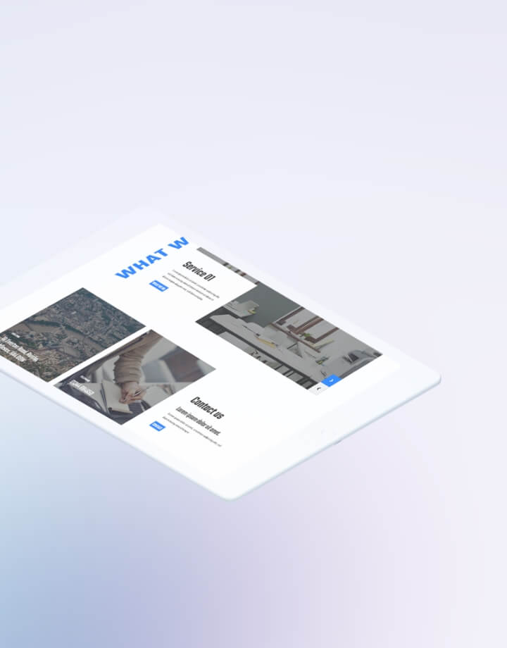
Also bearing in mind functionality, and as with any website design I undertake, I ensured that
it was made up of components where possible (including everything from text, buttons and headers ranging
all the way to components made up of multiple elements). Not only does this reduce development resource,
but it makes the website more responsive and expandable in the future. In essence, this makes the life
of the development teams much easier!
03.-
The Outcome
The outcome
With all of the above factors kept clearly in mind throughout the design process, the result was a
clean, professional website design which the client was extremely pleased with and approved with
essentially no adjustments (which is a big win in any designer's book!).
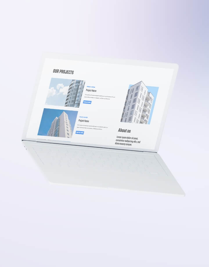
The website has now been built by their development team and the componentised design is
allowing them to keep growing the website as needed. While new pages will require a design, the
developers can still iterate on the website on a smaller scale.