01.-
Brief
Problem statement
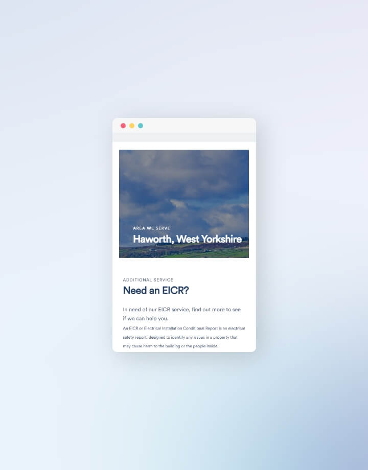
A local electrical firm, keen on providing customers with energy efficient, green solutions for their
homes and workplace. They were keen on a focus around their full house rewire and EICR services as
they already felt a natural growth in this area and wanted to push it more.
As with any business, a website would help them grow further, Ecospark planned to use their
website along with Pay Per Click advertisements and Search Engine Optimisation to promote their
business as well as attract more customers. The team needed a professional-looking website with an
engaging user experience that left a positive first impression on potential new customers.
02.-
Project Goal
To boost the business into another level by allowing them to effectively advertise to new potential customers
We wanted this project to display a more professional image, thereby attracting
larger jobs and a higher level of clientele. Aside from this online presence, needs were also determined
around retention of current customers, as well as the creation of an online business card to quickly
demonstrate the services offered.
Like any aspiring business, Ecospark wanted to stand out from competitors. One challenge was
that they wanted to be discreet about their eco services as (despite their name!) they had not fully
established this part of their business yet. Initial design concepts quickly were amended to incorporate
this change, with the agreement that the website should be adaptable and expansive so that these pages
could be included later.
The website was to be interactive and I determined that a means of achieving this would be
include micro transitions as an added feature - making the website feel animated and less static. What
does this add? An extra level of engagement with the customer, and a site that looks more bold, fresh,
and modern.
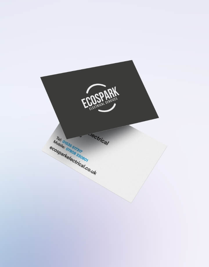
A top priority was the promotion of the Ecospark brand, which was still being established. As
things stood, they had a quite dated logo - I was asked to completely redesign it to fit into their new
website.
03.-
The Outcome
The result
Another handcrafted website, using small plugins to help with visually pleasing micro transitions,
i.e. the Ken Burns zoom effect, parallax scrolling and animation on scroll. The resulting website was
lively and animated, yet was still quick, responsive and had a small amount of data to load. The site
also incorporated a newly redesigned logo which was both complementary to the aesthetic of the
website, as well as providing a needed refresh of the brand image.
This is a website that the client is proud to use as the face of their business, with digital
advertising to help them draw in more customers, it gives them an improved and competitive digital
presence.
I look for ways to learn and improve based on each project I complete. With this project, it
became apparent that I was recreating a lot of components per each new website build. To improve
efficiency for future projects, I am establishing my own design system with related components and
style variants to help speed up the website build process.